Magazine analysis
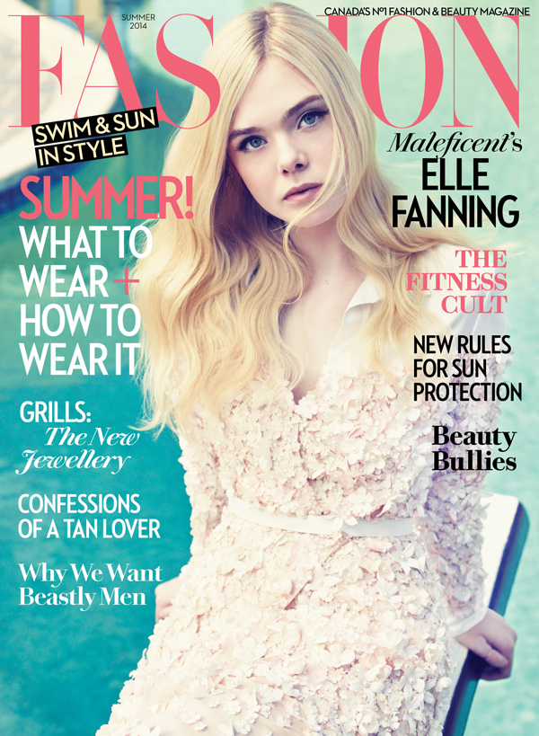
This magazine uses the colours white, black and pink to create the house style. The use of these colours and the colours in the main image create a summer vibe, representing the season. The house style also uses some serif and sans serif fonts to show variety and so its not repetitive. The masthead is in the pink colour to fit with the house style and again to show its summertime.
In the main cover image, Ellie Fanning's head overlaps some of the masthead to show that she is the most important item on the front cover. She also uses direct address by looking directly into the camera, creating personal identity. This attracts the audiences attention and makes them want to buy the magazine, as they can connect with Ellie. People might also want to buy the magazine for social interaction, as their friends could have spoken about it to them. Her body language is open, as she has her arms behind her back, to show she is confident. This will make the audience aspire to be like Ellie, so they might buy the magazine to find out why she is so confident and how they can be more like her. She is wearing a fashionable dress, linking to the theme of the magazine and showing that she is someone to aspire to be like as she has confidence and good fashion sense. Ellie Fanning is also a famous actress, creating star appeal for the audience, which is another reason to buy the magazine. This also attracts a secondary audience of Ellie Fanning fans, this therefore shows a fragmented audience, as the primary audience would be mainly young adults (16-24). The audience could be said to be mass, as there are a lot of girls in this age bracket. However, part of the audience could be niche, as people could read the magazine as they specifically like fashion. I think the audience would be from the class A, B, C1 in the social economic model, as it shows a famous actress on the front cover, and she is wearing an expensive and high quality looking dress. I think this magazine will attract the mainstreamers from the psychographics, as it is a magazine with different things for everyone to enjoy in the age range.
Part of a cover line says 'Swim & sun in style'. This shows alliteration through the words beginning with S. This creates enigma about what kind of things will be in the magazine, making the audience want to buy the magazine. They will also want to buy it to see how they can look fashionable in different situations. The cover line 'Beauty Bullies' also creates mystery, through alliteration as it doesn't give away what the story is about, so you have to buy the magazine to find out. The main cover line says 'Summer! What to wear + how to wear it', which is a clear and straightforward cover line, attracting audiences that are interested in this summers on trend fashion.
The tag line is 'Canada's No1 fashion & beauty magazine'. This clearly shows what is in the magazine, and by using 'No1' audiences are attracted, as it shows that it is a very good magazine. This shows that the target audience is predominantly female and adults, which is shown by the cover line 'Why we want beastly men'. The tag line can also attract niche audiences of people who are interested in fashion or beauty.
The date line only includes the season and the year 'Summer 2014' which could suggest that the magazine only comes out four times year, for every season.
No comments:
Post a Comment